Components
Module: @ui/badge
Shadcn reference: https://ui.shadcn.com/docs/components/badge

A small inline label for status, category, or count.
import { Badge } from "@ui/badge";
<div class="flex flex-row gap-[8px]"> <Badge><span>Default</span></Badge> <Badge variant="secondary"><span>Secondary</span></Badge> <Badge variant="destructive"><span>Destructive</span></Badge> <Badge variant="outline"><span>Outline</span></Badge></div>Module: @ui/card
Shadcn reference: https://ui.shadcn.com/docs/components/card
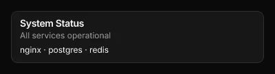
A styled container with rounded corners, a border, and card background colour.
Wraps arbitrary child nodes and accepts an optional class attribute for Tailwind overrides.
import { Card, CardContent, CardDescription, CardHeader, CardTitle } from "@ui/card";
<Card class="flex flex-col gap-[6px]">  <CardHeader>    <CardTitle><span>System Status</span></CardTitle>    <CardDescription><span>All services operational</span></CardDescription>  </CardHeader>  <CardContent>    <span class="text-foreground text-[12px]">nginx · postgres · redis</span>  </CardContent></Card>
CardContent
Section titled “CardContent”Module: @ui/card
CardDescription
Section titled “CardDescription”Module: @ui/card
CardFooter
Section titled “CardFooter”Module: @ui/card
CardHeader
Section titled “CardHeader”Module: @ui/card
CardTitle
Section titled “CardTitle”Module: @ui/card
DataTable
Section titled “DataTable”Module: @ui/datatable
Shadcn reference: https://ui.shadcn.com/docs/components/table
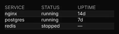
A data-driven table. Renders a header row followed by data rows with
alternating bg-card / bg-muted/30 backgrounds. Columns map a key
(used to look up values in each row object) to a label (shown in the
header). An optional width constrains the column.
For full compositional control, use the Table, TableHeader, TableBody,
TableRow, TableHead, and TableCell primitives from @ui/table instead.
import { DataTable } from "@ui/datatable";
<DataTable columns={[{key:"service", label:"SERVICE"}, {key:"status", label:"STATUS"}, {key:"uptime", label:"UPTIME"}]} rows={[ {service:"nginx", status:"running", uptime:"14d"}, {service:"postgres", status:"running", uptime:"7d"}, {service:"redis", status:"stopped", uptime:"—"}, ]}/>Module: @ui/icon
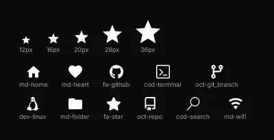
Renders a single Nerd Font glyph by icon name.
name uses the Nerd Fonts naming convention: {family}-{icon},
e.g. md-home, fa-github, cod-terminal.
Full catalogue: https://www.nerdfonts.com/cheat-sheet
Unknown names render as ?.
import { Icon } from "@ui/icon";
<div class="flex flex-col gap-[16px] p-[12px]">  <div class="flex flex-row items-end gap-[20px]">    <div class="flex flex-col items-center gap-[4px]">      <Icon name="md-star" class="text-[12px]" />      <span class="text-[9px] text-muted-foreground">12px</span>    </div>    <div class="flex flex-col items-center gap-[4px]">      <Icon name="md-star" class="text-[16px]" />      <span class="text-[9px] text-muted-foreground">16px</span>    </div>    <div class="flex flex-col items-center gap-[4px]">      <Icon name="md-star" class="text-[20px]" />      <span class="text-[9px] text-muted-foreground">20px</span>    </div>    <div class="flex flex-col items-center gap-[4px]">      <Icon name="md-star" class="text-[28px]" />      <span class="text-[9px] text-muted-foreground">28px</span>    </div>    <div class="flex flex-col items-center gap-[4px]">      <Icon name="md-star" class="text-[36px]" />      <span class="text-[9px] text-muted-foreground">36px</span>    </div>  </div>  <div class="flex flex-row flex-wrap gap-x-[20px] gap-y-[12px]">    <div class="flex flex-col items-center gap-[4px]">      <Icon name="md-home" class="text-[20px]" />      <span class="text-[9px] text-muted-foreground">md-home</span>    </div>    <div class="flex flex-col items-center gap-[4px]">      <Icon name="md-heart" class="text-[20px]" />      <span class="text-[9px] text-muted-foreground">md-heart</span>    </div>    <div class="flex flex-col items-center gap-[4px]">      <Icon name="fa-github" class="text-[20px]" />      <span class="text-[9px] text-muted-foreground">fa-github</span>    </div>    <div class="flex flex-col items-center gap-[4px]">      <Icon name="cod-terminal" class="text-[20px]" />      <span class="text-[9px] text-muted-foreground">cod-terminal</span>    </div>    <div class="flex flex-col items-center gap-[4px]">      <Icon name="oct-git_branch" class="text-[20px]" />      <span class="text-[9px] text-muted-foreground">oct-git_branch</span>    </div>    <div class="flex flex-col items-center gap-[4px]">      <Icon name="dev-linux" class="text-[20px]" />      <span class="text-[9px] text-muted-foreground">dev-linux</span>    </div>    <div class="flex flex-col items-center gap-[4px]">      <Icon name="md-folder" class="text-[20px]" />      <span class="text-[9px] text-muted-foreground">md-folder</span>    </div>    <div class="flex flex-col items-center gap-[4px]">      <Icon name="fa-star" class="text-[20px]" />      <span class="text-[9px] text-muted-foreground">fa-star</span>    </div>    <div class="flex flex-col items-center gap-[4px]">      <Icon name="oct-repo" class="text-[20px]" />      <span class="text-[9px] text-muted-foreground">oct-repo</span>    </div>    <div class="flex flex-col items-center gap-[4px]">      <Icon name="cod-search" class="text-[20px]" />      <span class="text-[9px] text-muted-foreground">cod-search</span>    </div>    <div class="flex flex-col items-center gap-[4px]">      <Icon name="md-wifi" class="text-[20px]" />      <span class="text-[9px] text-muted-foreground">md-wifi</span>    </div>  </div></div>
Progress
Section titled “Progress”Module: @ui/progress
Shadcn reference: https://ui.shadcn.com/docs/components/progress

A horizontal progress bar. Renders a muted track with a filled segment
proportional to value (0–100). An optional color prop overrides the
fill colour; class applies extra Tailwind classes to the track.
import { Progress } from "@ui/progress";
<div class="flex flex-col gap-[6px] w-[200px]"> <div class="flex flex-row justify-between"> <span class="text-muted-foreground text-[11px]">Memory</span> <span class="text-foreground text-[11px]">72%</span> </div> <Progress value={72} /></div>Module: @ui/table
Shadcn reference: https://ui.shadcn.com/docs/components/table

Composable table primitives. Use these to build fully custom table layouts.
For a data-driven table, use DataTable from @ui/datatable instead.
import { Table, TableBody, TableCell, TableHead, TableHeader, TableRow } from "@ui/table";
<Table>  <TableHeader>    <TableRow>      <TableHead><span>SERVICE</span></TableHead>      <TableHead><span>STATUS</span></TableHead>      <TableHead><span>UPTIME</span></TableHead>    </TableRow>  </TableHeader>  <TableBody>    <TableRow>      <TableCell><span>nginx</span></TableCell>      <TableCell class="text-green-500"><span>running</span></TableCell>      <TableCell><span>14d</span></TableCell>    </TableRow>  </TableBody></Table>
TableBody
Section titled “TableBody”Module: @ui/table
TableCell
Section titled “TableCell”Module: @ui/table
TableHead
Section titled “TableHead”Module: @ui/table
TableHeader
Section titled “TableHeader”Module: @ui/table
TableRow
Section titled “TableRow”Module: @ui/table