Component reference
Every component tauler ships, grouped by kind. The components page says what the kinds mean and how to choose between them.
Display components
Section titled “Display components”Module: @ui/badge
Shadcn reference: https://ui.shadcn.com/docs/components/badge

A small inline label for status, category, or count.
import { Badge } from "@ui/badge";
<div class="flex flex-row gap-[8px]"> <Badge><span>Default</span></Badge> <Badge variant="secondary"><span>Secondary</span></Badge> <Badge variant="destructive"><span>Destructive</span></Badge> <Badge variant="outline"><span>Outline</span></Badge></div>Module: @ui/card
Shadcn reference: https://ui.shadcn.com/docs/components/card
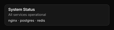
A styled container with rounded corners, a border, and card background colour.
Wraps arbitrary child nodes and accepts an optional class attribute for Tailwind overrides.
<CardContent><CardDescription><CardFooter><CardHeader><CardTitle>
import { Card, CardContent, CardDescription, CardHeader, CardTitle } from "@ui/card";
<Card class="flex flex-col gap-[6px]">  <CardHeader>    <CardTitle><span>System Status</span></CardTitle>    <CardDescription><span>All services operational</span></CardDescription>  </CardHeader>  <CardContent>    <span class="text-foreground text-[12px]">nginx · postgres · redis</span>  </CardContent></Card>
DataTable
Section titled “DataTable”Module: @ui/datatable
Shadcn reference: https://ui.shadcn.com/docs/components/table
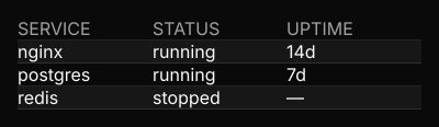
A data-driven table. Renders a header row followed by data rows with
alternating bg-card / bg-muted/30 backgrounds. Columns map a key
(used to look up values in each row object) to a label (shown in the
header). An optional width constrains the column.
For full compositional control, use the Table, TableHeader, TableBody,
TableRow, TableHead, and TableCell primitives from @ui/table instead.
import { DataTable } from "@ui/datatable";
<DataTable columns={[{key:"service", label:"SERVICE"}, {key:"status", label:"STATUS"}, {key:"uptime", label:"UPTIME"}]} rows={[ {service:"nginx", status:"running", uptime:"14d"}, {service:"postgres", status:"running", uptime:"7d"}, {service:"redis", status:"stopped", uptime:"—"}, ]}/>Module: @ui/icon
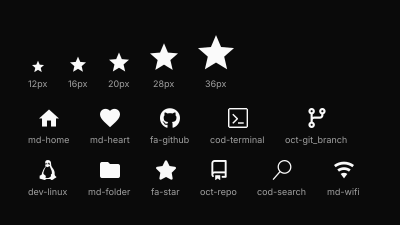
Renders a single Nerd Font glyph by icon name.
name uses the Nerd Fonts naming convention: {family}-{icon},
e.g. md-home, fa-github, cod-terminal.
Full catalogue: https://www.nerdfonts.com/cheat-sheet
Unknown names render as ?.
import { Icon } from "@ui/icon";
<div class="flex flex-col gap-[16px] p-[12px]">  <div class="flex flex-row items-end gap-[20px]">    <div class="flex flex-col items-center gap-[4px]">      <Icon name="md-star" class="text-[12px]" />      <span class="text-[9px] text-muted-foreground">12px</span>    </div>    <div class="flex flex-col items-center gap-[4px]">      <Icon name="md-star" class="text-[16px]" />      <span class="text-[9px] text-muted-foreground">16px</span>    </div>    <div class="flex flex-col items-center gap-[4px]">      <Icon name="md-star" class="text-[20px]" />      <span class="text-[9px] text-muted-foreground">20px</span>    </div>    <div class="flex flex-col items-center gap-[4px]">      <Icon name="md-star" class="text-[28px]" />      <span class="text-[9px] text-muted-foreground">28px</span>    </div>    <div class="flex flex-col items-center gap-[4px]">      <Icon name="md-star" class="text-[36px]" />      <span class="text-[9px] text-muted-foreground">36px</span>    </div>  </div>  <div class="flex flex-row flex-wrap gap-x-[20px] gap-y-[12px]">    <div class="flex flex-col items-center gap-[4px]">      <Icon name="md-home" class="text-[20px]" />      <span class="text-[9px] text-muted-foreground">md-home</span>    </div>    <div class="flex flex-col items-center gap-[4px]">      <Icon name="md-heart" class="text-[20px]" />      <span class="text-[9px] text-muted-foreground">md-heart</span>    </div>    <div class="flex flex-col items-center gap-[4px]">      <Icon name="fa-github" class="text-[20px]" />      <span class="text-[9px] text-muted-foreground">fa-github</span>    </div>    <div class="flex flex-col items-center gap-[4px]">      <Icon name="cod-terminal" class="text-[20px]" />      <span class="text-[9px] text-muted-foreground">cod-terminal</span>    </div>    <div class="flex flex-col items-center gap-[4px]">      <Icon name="oct-git_branch" class="text-[20px]" />      <span class="text-[9px] text-muted-foreground">oct-git_branch</span>    </div>    <div class="flex flex-col items-center gap-[4px]">      <Icon name="dev-linux" class="text-[20px]" />      <span class="text-[9px] text-muted-foreground">dev-linux</span>    </div>    <div class="flex flex-col items-center gap-[4px]">      <Icon name="md-folder" class="text-[20px]" />      <span class="text-[9px] text-muted-foreground">md-folder</span>    </div>    <div class="flex flex-col items-center gap-[4px]">      <Icon name="fa-star" class="text-[20px]" />      <span class="text-[9px] text-muted-foreground">fa-star</span>    </div>    <div class="flex flex-col items-center gap-[4px]">      <Icon name="oct-repo" class="text-[20px]" />      <span class="text-[9px] text-muted-foreground">oct-repo</span>    </div>    <div class="flex flex-col items-center gap-[4px]">      <Icon name="cod-search" class="text-[20px]" />      <span class="text-[9px] text-muted-foreground">cod-search</span>    </div>    <div class="flex flex-col items-center gap-[4px]">      <Icon name="md-wifi" class="text-[20px]" />      <span class="text-[9px] text-muted-foreground">md-wifi</span>    </div>  </div></div>
Progress
Section titled “Progress”Module: @ui/progress
Shadcn reference: https://ui.shadcn.com/docs/components/progress

A horizontal progress bar. Renders a muted track with a filled segment
proportional to value (0–100). An optional color prop overrides the
fill colour; class applies extra Tailwind classes to the track.
import { Progress } from "@ui/progress";
<div class="flex flex-col gap-[6px] w-[200px]"> <div class="flex flex-row justify-between"> <span class="text-muted-foreground text-[11px]">Memory</span> <span class="text-foreground text-[11px]">72%</span> </div> <Progress value={72} /></div>Module: @ui/table
Shadcn reference: https://ui.shadcn.com/docs/components/table
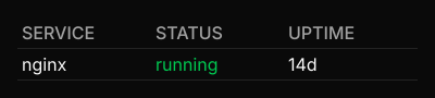
Composable table primitives. Use these to build fully custom table layouts.
For a data-driven table, use DataTable from @ui/datatable instead.
<TableBody><TableCell><TableHead><TableHeader><TableRow>
import { Table, TableBody, TableCell, TableHead, TableHeader, TableRow } from "@ui/table";
<Table>  <TableHeader>    <TableRow>      <TableHead><span>SERVICE</span></TableHead>      <TableHead><span>STATUS</span></TableHead>      <TableHead><span>UPTIME</span></TableHead>    </TableRow>  </TableHeader>  <TableBody>    <TableRow>      <TableCell><span>nginx</span></TableCell>      <TableCell class="text-green-500"><span>running</span></TableCell>      <TableCell><span>14d</span></TableCell>    </TableRow>  </TableBody></Table>
Control components
Section titled “Control components”Module: @ui/knob

A rotary knob. Draws value as an angle in degrees — 0 points up, and the angle
increases clockwise — and reports the angle you turn it to.
It never remembers anything. value is read every tick from whatever owns it, and
on_change receives the new angle and returns the intents to send — one, or an
array of them.
<Module bin="~/.cargo/bin/tauler-audio"> {(data, events) => ( <Knob value={data?.balance ?? 0} step={5} on_change={deg => events.setBalance({ deg })} /> )}</Module>The turn sets nothing locally: it sends intents, the module changes the angle, and
the next tick brings the new value back. Omit on_change and the knob still
renders — it is simply not interactive.
There is no min and no max, because the knob measures how far you have turned
it rather than where on a scale you are pointing. Pressing it anywhere is a turn of
zero, so it never jumps to meet the pointer, and a fast flick and a slow drag that
end in the same place give the same angle.
The inner third is a hub that reports nothing. A bearing taken there is meaningless — undefined at the exact centre, and swinging through tens of degrees per pixel around it — so a press that lands in the hub, or a drag that wanders into it, is ignored rather than allowed to leap. Turn it by the rim.
value and the reported angle have deliberately different domains. value is drawn
as given, so 450 and -90 point where they say. What on_change reports is always
wrapped into 0–360, so turning past the top comes round rather than running off and a
module’s stored number cannot drift out to thousands. What it cannot report is how
many whole turns you made — there is no scale for them to mean anything on.
step defaults to 1 and rounds the turn, not the angle it lands on. Rounding the
angle would move a press that has not travelled at all, and would shift the grid a
little further every lap for a step that does not divide a circle. Rounding is also
what keeps a turn from sending a message per pixel: a motion that produces the
intents just sent is skipped.
import { Knob } from "@ui/knob";
<div class="flex flex-row gap-[12px] items-center">  <Knob value={0} />  <Knob value={45} />  <Knob value={135} />  <Knob value={250} /></div>
ScrollArea
Section titled “ScrollArea”Module: @ui/scroll-area
Shadcn reference: https://ui.shadcn.com/docs/components/scroll-area

A scrollable viewport: clips children to its box and translates them up by
scroll_top, with a <ScrollBar> rendered alongside as the draggable indicator.
content_height and viewport_height describe the content’s full height and the
visible window into it — the same terms <ScrollBar> uses, since the two share
clamp_scroll_top so their notions of the valid range can’t drift apart.
It never remembers anything (ADR 0012): scroll_top is read every tick from
whatever owns it, and on_change (wired through to the composed scrollbar’s
thumb) receives where a drag has moved it and returns the intents to send.
<Module bin="~/.cargo/bin/tauler-logs"> {(data, events) => ( <ScrollArea scroll_top={data?.scroll_top ?? 0} content_height={data?.lines?.length * 18 ?? 0} viewport_height={120} on_change={top => events.setScrollTop({ top })} class="h-[120px] w-[240px]" > {(data?.lines ?? []).map(line => <span class="text-[11px]">{line}</span>)} </ScrollArea> )}</Module>The drag sets nothing locally: it sends intents, the module changes scroll_top,
and the next tick brings the new value back — the same round trip <Slider> and
<Knob> make. Omit on_change and <ScrollArea> still renders, clipped and
translated to scroll_top, just not draggable.
show_scrollbar controls the composed scrollbar’s visibility: omitted, it shows
only when content_height > viewport_height (nothing to scroll draws no visible
thumb, matching shadcn’s own default); true forces it to always show, false
forces it to always hide, regardless of whether scrolling is actually needed.
import { ScrollArea } from "@ui/scroll-area";
<ScrollArea  scroll_top={40}  content_height={300}  viewport_height={120}  class="h-[120px] w-[240px]">  <span class="text-[11px]">a lot of content…</span></ScrollArea>
ScrollBar
Section titled “ScrollBar”Module: @ui/scroll-bar
Shadcn reference: https://ui.shadcn.com/docs/components/scroll-area

A vertical scrollbar: a track with a thumb whose position and size are derived
from scroll_top, content_height, and viewport_height — the thumb sits at
scroll_top / content_height down the track and spans viewport_height / content_height of it, floored at MIN_THUMB_HEIGHT so it never shrinks below a
draggable size.
<ScrollArea> renders one of these internally, so most layouts never reach for
<ScrollBar> directly. Import it standalone when a scrollable region needs its
indicator drawn somewhere other than where <ScrollArea> puts it — alongside the
viewport rather than inside it, for instance.
It never remembers anything (ADR 0012): scroll_top is read every tick from
whatever owns it, and on_change receives where a drag has moved the thumb to and
returns the intents to send. Omit on_change and the scrollbar still renders — a
static indicator of scroll_top, not interactive.
import { ScrollBar } from "@ui/scroll-bar";
<ScrollBar  scroll_top={40}  content_height={480}  viewport_height={120}  class="h-[120px]"/>
Slider
Section titled “Slider”Module: @ui/slider
Shadcn reference: https://ui.shadcn.com/docs/components/slider

A horizontal slider. Draws value within min–max, and reports where you
press or drag.
It never remembers anything. value is read every tick from whatever owns it,
and on_change receives the value under the pointer and returns the intents to
send — one, or an array of them. Pressing counts as the first drag event, so a
plain click sets the value too.
<Module bin="~/.cargo/bin/tauler-audio"> {(data, events) => ( <Slider value={data?.volume ?? 0} step={5} on_change={v => events.setVolume({ volume: v })} /> )}</Module>The drag sets nothing locally: it sends intents, the module changes the volume,
and the next tick brings the new value back. Omit on_change and the slider
still renders — it is simply not interactive.
min defaults to 0, max to 100, and step to 1. step rounds the reported
value, which is also what keeps a drag from sending a message per pixel: a motion
that produces the intents just sent is skipped.
The example below names a module, tauler-demo-volume, that you will not have —
pasted as it stands it renders a slider that does not move. It names one anyway,
because a slider with a literal value and no source would show you a control
holding its own state, which is the one thing this component does not do. On this
page the module is a few lines of JavaScript in the browser rather than a
subprocess; the layout file cannot tell the difference, and that is the point.
import { Slider } from "@ui/slider";
const events = useEvents("tauler-demo-volume");const volume = Number(useStringStream("tauler-demo-volume")) || 40;
return (  <div class="flex flex-col gap-[6px] w-[200px]">    <div class="flex flex-row justify-between">      <span class="text-muted-foreground text-[11px]">Volume</span>      <span class="text-foreground text-[11px]">{volume}%</span>    </div>    <Slider value={volume} step={5} on_change={(v) => events.set({ value: v })} />  </div>);